Whether you call it eggplant or aubergine, it’s tasty when you roast it in the oven!
Of course it’s also good with tomatoes.
Eggplant is a popular still life vegetable. It has a beautiful deep purple skin and it’s very glossy. Most of the color shows up in the highlight reflections. The rest of it is so dark it almost looks black.
The original painting is for sale on Daily Paintworks.
Prints of this painting are also available, click the red button below to view them. There are a variety of print products available: photographic prints, art prints, framed prints etc.
I started this painting with a coat of transparent red. I mixed it from Quinacridone Magenta and Hansa Yellow Medium. The transparency allows the drawing to show through. I added some Pyrrole Red in some areas because I wanted the brightest red possible.
Showing posts with label Still Life Painting. Show all posts
Showing posts with label Still Life Painting. Show all posts
Saturday, April 11, 2020

Saturday, April 4, 2020
Bottles With Turquoise
I like experimenting with my own color schemes. So in this painting I started by toning the canvas with turquoise.
I don't actually have turquoise in my set of Golden OPEN acrylics but I was able to mix my own. You can mix a fairly good turquoise by mixing Phthalo Blue with a little bit of yellow and white.
I don't actually have turquoise in my set of Golden OPEN acrylics but I was able to mix my own. You can mix a fairly good turquoise by mixing Phthalo Blue with a little bit of yellow and white.
Saturday, March 21, 2020
Granny Smith With Two Macs
In this painting, I thought I would combine a green apple with red apples. I enjoy working with color and combining warm with cool colors.
The original painting is for sale.
Not only are the McIntosh apples a warm color but they're much darker, especially in the shadow areas. It's the same Granny Smith from last weeks painting, but I'm painting it in a much thinner manner.
The white plate is always a challenge to paint from the side like this because it turns it into a narrow ellipse. If I'm off in the slightest it will look like it's warped.
The original painting is for sale.
Not only are the McIntosh apples a warm color but they're much darker, especially in the shadow areas. It's the same Granny Smith from last weeks painting, but I'm painting it in a much thinner manner.
The white plate is always a challenge to paint from the side like this because it turns it into a narrow ellipse. If I'm off in the slightest it will look like it's warped.
 |
| Granny Smith With Two Macs 8"x10" Acrylic on canvas board Chris Breier © 2020 |
Saturday, March 14, 2020
Granny Smith With Bottle
This Granny Smith apple has been sitting on my cupboard for about a week now.
The original painting is for sale.
These apples are fairly tart but they go well with my oatmeal. I slice them up and add it to the oats and then microwave it on high for a few minutes. Cinnamon and flax meal are a good addition too.
I like to think that the glass bottle in the painting is an empty cinnamon spice bottle.
Sometimes, when I'm in a hurry, I'll add in a few frozen blueberries to help cool it down after it’s done cooking in the microwave-they’re like mini ice cubes. I frequently eat oats for breakfast because it’s a convenient and yet tasty breakfast.
The original painting is for sale.
These apples are fairly tart but they go well with my oatmeal. I slice them up and add it to the oats and then microwave it on high for a few minutes. Cinnamon and flax meal are a good addition too.
I like to think that the glass bottle in the painting is an empty cinnamon spice bottle.
Sometimes, when I'm in a hurry, I'll add in a few frozen blueberries to help cool it down after it’s done cooking in the microwave-they’re like mini ice cubes. I frequently eat oats for breakfast because it’s a convenient and yet tasty breakfast.
Saturday, March 7, 2020
Acorn Squash
What I like about this painting is the subdued oranges and greens. The warmth of the light orange interior with the dark green exterior is pleasing color combination.
The original painting is for sale.
The greens are rather dark, almost pure black in the shadow areas. The highlights turn slightly blueish, which gives the impression of the dull waxy appearance that the skin has.
While I was painting it, the orange flesh made me think of cantaloupe. Once they’re back in season, I think I may paint one of them.
I think what helps make the color pop a little more, even though they’re not that saturated, is the gray background. Neutral grays can help the colors in a painting stand out more so than if the entire painting was in bright colors.
Once I was done taking reference photos for this painting, I roasted the squash and the seeds in the oven.
The original painting is for sale.
The greens are rather dark, almost pure black in the shadow areas. The highlights turn slightly blueish, which gives the impression of the dull waxy appearance that the skin has.
While I was painting it, the orange flesh made me think of cantaloupe. Once they’re back in season, I think I may paint one of them.
I think what helps make the color pop a little more, even though they’re not that saturated, is the gray background. Neutral grays can help the colors in a painting stand out more so than if the entire painting was in bright colors.
Once I was done taking reference photos for this painting, I roasted the squash and the seeds in the oven.
Saturday, February 8, 2020
Potions II
The original painting is for sale.
This painting is along the same lines as the other painting of bottles from a few weeks ago.
I like the design of glass bottles, new and old. These are new bottles that are designed to look like vintage bottles.
The glass is wavy and I like the distortion that it creates. Those wavy patterns were the most interesting part to paint.
It occurred to me while I was working on this painting, that glass bottles are becoming more of a rarity.
This painting is along the same lines as the other painting of bottles from a few weeks ago.
I like the design of glass bottles, new and old. These are new bottles that are designed to look like vintage bottles.
The glass is wavy and I like the distortion that it creates. Those wavy patterns were the most interesting part to paint.
It occurred to me while I was working on this painting, that glass bottles are becoming more of a rarity.
Saturday, February 1, 2020
Pink Rose
The original painting is available.
This is the third painting that is from the bouquet of flowers that I bought a few weeks ago. When I buy flowers I like to photograph them in a variety of settings so that I can get more than one painting from it.
For example, I took the rose from the bouquet and put it in a different vase.
I like this thin vase and I thought that a single, bright pink rose would be striking. I wanted a simple but background that would make the rose stand out.
You can watch me paint this in the YouTube video below.
This is the third painting that is from the bouquet of flowers that I bought a few weeks ago. When I buy flowers I like to photograph them in a variety of settings so that I can get more than one painting from it.
For example, I took the rose from the bouquet and put it in a different vase.
I like this thin vase and I thought that a single, bright pink rose would be striking. I wanted a simple but background that would make the rose stand out.
You can watch me paint this in the YouTube video below.
Sunday, January 19, 2020
Pink Flowers
The original painting is still available.
These flowers came with the vase and included a couple of roses. I suppose that's why they were more expensive than the flowers that I have been buying.
This painting is similar to "Safari Sunset." The background colors are the same and I photographed them on a table using natural sunlight. You can't beat natural sunlight for bringing out the colors of flowers.
The colors of the flowers range from light magenta to dark burgundy, which creates a nice contrast against the green stems.
These flowers came with the vase and included a couple of roses. I suppose that's why they were more expensive than the flowers that I have been buying.
This painting is similar to "Safari Sunset." The background colors are the same and I photographed them on a table using natural sunlight. You can't beat natural sunlight for bringing out the colors of flowers.
The colors of the flowers range from light magenta to dark burgundy, which creates a nice contrast against the green stems.
Saturday, January 11, 2020
Three Macs
The original painting is still available.
I recently bought a large bag of McIntosh apples at the supermarket. These are the ones that are a little smaller than the premium apples. They may be smaller, but they still taste good.
I like to cut them up and put them in my oatmeal in the morning. I add some cinnamon, walnuts, and sprinkle in some flaxseed meal. Flaxseed meal doesn't add much flavor but it’s good for you.
The quick oats only take 2-3 minutes to cook in the microwave so it’s convenient for when you're short on time. I don't like to skip breakfast so I always have a large canister of oats in the cupboard.
I recently bought a large bag of McIntosh apples at the supermarket. These are the ones that are a little smaller than the premium apples. They may be smaller, but they still taste good.
I like to cut them up and put them in my oatmeal in the morning. I add some cinnamon, walnuts, and sprinkle in some flaxseed meal. Flaxseed meal doesn't add much flavor but it’s good for you.
The quick oats only take 2-3 minutes to cook in the microwave so it’s convenient for when you're short on time. I don't like to skip breakfast so I always have a large canister of oats in the cupboard.
Saturday, January 4, 2020
Lemon Water
The idea for this painting came from the extra lemons I had laying around the kitchen.
This painting is still available.
I use them mostly for making hummus and tahini salad dressing. I make my own hummus because it's an easy recipe and it saves money. I also find that the store bought hummus contains a lot of unnecessary olive oil and salt.
Another benefit of making my own hummus is that I can flavor it however I want. During the summer I may add some dill to it. Or, if I don't have fresh herbs on hand, I'll add a dash of cumin or paprika.
I'll whip up a batch of hummus and eat with bread, pita, or spread it on sandwiches. It's also good with pretzels when you're watching a movie.
This painting is still available.
I use them mostly for making hummus and tahini salad dressing. I make my own hummus because it's an easy recipe and it saves money. I also find that the store bought hummus contains a lot of unnecessary olive oil and salt.
Another benefit of making my own hummus is that I can flavor it however I want. During the summer I may add some dill to it. Or, if I don't have fresh herbs on hand, I'll add a dash of cumin or paprika.
I'll whip up a batch of hummus and eat with bread, pita, or spread it on sandwiches. It's also good with pretzels when you're watching a movie.
Sunday, December 29, 2019
Potions
SOLD
I found these bottles on sale at one of those big box craft stores, they were on sale for 50% off.
I suppose I could get glass bottles for free if I was willing to rummage through the neighborhood recycling bins, but that's not my forte : ) Besides, these bottles have a wavy appearance to simulate the look of antique bottles. They also have corks instead of the modern screw on caps which adds to the vintage look.
I found these bottles on sale at one of those big box craft stores, they were on sale for 50% off.
I suppose I could get glass bottles for free if I was willing to rummage through the neighborhood recycling bins, but that's not my forte : ) Besides, these bottles have a wavy appearance to simulate the look of antique bottles. They also have corks instead of the modern screw on caps which adds to the vintage look.
Saturday, December 7, 2019
Orange Slices
I have a love-hate relationship with oranges. Oranges are great when they’re juicy and sweet, but sometimes you get one that’s dry and chewy. What do you do with those?
This painting is still available, click to view the auction.
The way that I deal with subpar oranges is that I slice them with a knife and then bite into them, and suck all of the juice out of them. Then I throw the rest of it away because it’s too tough to chew.
Recently, I painted an orange and I thought it would be interesting to paint one that’s cut into slices. I was thinking that the interior has a greater variety of color and texture. The wedges could be arranged into patterns too.
Usually, I take my reference photos early in the morning before breakfast. I was hungry and I could smell the orange, but I had to wait until I was done taking pictures before I could take a bite. Well, I could have ate it, but I would have lost my still life material!
I spent some time trying to arrange these oranges into an interesting composition. “Composition” is art lingo for how the shapes are arranged in a painting. You can't just randomly frame a subject and expect it to look good.
There are some basic principles of composition that you can follow. Photographers often talk about the “rule of thirds” which means that you divide the canvas into thirds and place the subject along on one of those lines.
I like to simplify the rule of thirds into meaning- don’t center the subject or place it too close the edges.
Another issue I had was there wasn't much color in the image, aside from the orange. For fun, I placed a sheet of blue paper under the plate of orange slices.
That seemed to do the trick!
I liked how the blue is reflected in the white dish, and it’s dark enough to add some contrast to the white plate. Obviously, the blue and the orange provide a warm/cool color contrast too.
Speaking of the color orange, I bought a tube of Cadmium Orange just for this painting. I can mix orange myself, but I wanted the brightest orange that's available. Cadmium Orange is a tad more saturated than the orange that you can mix. It’s also more opaque.
I can mix orange from Pyrrole Red and Hansa Yellow Medium. Another formula for orange is to mix Quinacridone Magenta with Hansa Yellow Medium. However, both of these mixtures are transparent. Opaque colors makes it easier to cover over previous layers.
One subtle detail is the orange color that's reflected in the blue paper. That's a difficult color to mix.
Another fun fact about painting. It doesn't matter how much planning that you do beforehand, there’s always something that doesn't work and you have to figure it out as you go.
When I began this painting, I thought that the background could be simple and that I could incorporate some bold brushstrokes. As the painting progressed, I realized that I needed to capture the subtle lighting effect in the background to make it more dramatic. You can watch me blend the grays in the background in the YouTube video at the top of this post.
I don't know if it was because I was hungry, or if the orange was extra ripe, but it tasted great! It was nice and juicy and it wasn’t tough at all.
This painting is still available, click to view the auction.
The way that I deal with subpar oranges is that I slice them with a knife and then bite into them, and suck all of the juice out of them. Then I throw the rest of it away because it’s too tough to chew.
Recently, I painted an orange and I thought it would be interesting to paint one that’s cut into slices. I was thinking that the interior has a greater variety of color and texture. The wedges could be arranged into patterns too.
Usually, I take my reference photos early in the morning before breakfast. I was hungry and I could smell the orange, but I had to wait until I was done taking pictures before I could take a bite. Well, I could have ate it, but I would have lost my still life material!
I spent some time trying to arrange these oranges into an interesting composition. “Composition” is art lingo for how the shapes are arranged in a painting. You can't just randomly frame a subject and expect it to look good.
There are some basic principles of composition that you can follow. Photographers often talk about the “rule of thirds” which means that you divide the canvas into thirds and place the subject along on one of those lines.
I like to simplify the rule of thirds into meaning- don’t center the subject or place it too close the edges.
Another issue I had was there wasn't much color in the image, aside from the orange. For fun, I placed a sheet of blue paper under the plate of orange slices.
That seemed to do the trick!
 |
| “Orange Slices“ Acrylic on canvas 8"x10" Chris Breier 2019 © |
I liked how the blue is reflected in the white dish, and it’s dark enough to add some contrast to the white plate. Obviously, the blue and the orange provide a warm/cool color contrast too.
Speaking of the color orange, I bought a tube of Cadmium Orange just for this painting. I can mix orange myself, but I wanted the brightest orange that's available. Cadmium Orange is a tad more saturated than the orange that you can mix. It’s also more opaque.
I can mix orange from Pyrrole Red and Hansa Yellow Medium. Another formula for orange is to mix Quinacridone Magenta with Hansa Yellow Medium. However, both of these mixtures are transparent. Opaque colors makes it easier to cover over previous layers.
One subtle detail is the orange color that's reflected in the blue paper. That's a difficult color to mix.
Another fun fact about painting. It doesn't matter how much planning that you do beforehand, there’s always something that doesn't work and you have to figure it out as you go.
When I began this painting, I thought that the background could be simple and that I could incorporate some bold brushstrokes. As the painting progressed, I realized that I needed to capture the subtle lighting effect in the background to make it more dramatic. You can watch me blend the grays in the background in the YouTube video at the top of this post.
I don't know if it was because I was hungry, or if the orange was extra ripe, but it tasted great! It was nice and juicy and it wasn’t tough at all.
Saturday, November 30, 2019
Apple Cider
This is an appropriate subject to work on in November. I often visit Letchworth State Park in the fall to view the leaves. On the way there I look for a farm that sells apples. Buying apples direct from the farmers is not only cheaper but the apples are usually fresher.
Years ago, I found a farmer that also sold apple cider. He kept jugs of it in a cooler with ice and you would just help yourself and put your money in a locked box. A lot of farmers use an “honor system” like this. I suppose it’s the reason why the produce is less expensive at the farm. They don’t have to haul their produce down to a farmers market and spend their weekends chatting with customers, and making change for everyone.
Years ago, I found a farmer that also sold apple cider. He kept jugs of it in a cooler with ice and you would just help yourself and put your money in a locked box. A lot of farmers use an “honor system” like this. I suppose it’s the reason why the produce is less expensive at the farm. They don’t have to haul their produce down to a farmers market and spend their weekends chatting with customers, and making change for everyone.
Sunday, November 17, 2019
Tangerine Dream
This painting is still available. Click this link to view the auction.
The glass bowl in this painting is another garage sale find. I have a storage shelf filled with glass bowls, vases, and other interesting objects that I can incorporate into my still life paintings.
I recently watched an episode of American Pickers and they were visiting the studio of a professional photographer. His studio was the size of a warehouse and it was packed with a variety of props and antique objects that he would use in his photographs.
If I'm not careful, I may end up with a large collection of props like this guy! One way that I avoid accumulating too many props is to donate them to charity when I'm done with them. Of course, if I'm photographing food, I can eat the props when I'm done.
I don't think most people realize the behind the scenes work that goes into a still life painting or photograph. Of course, you can use the objects in your house to create still life paintings. However, at some point you're going to need to expand beyond what you already have on hand.
Friday, November 15, 2019
Pink Yellow & Blue Flowers
 |
| Pink Yellow & Blue Flowers 8"x10" Acrylic on canvas board |
This painting is available, click to view the auction. I bought this vase when I was walking to the local farmers market. My neighborhood coordinated a garage sale for a Saturday morning.
Garage sales are great places to look for still life material. You can find older objects and the prices are usually fair. I stopped at two of them and they both had flower vases, which was something that I was looking for.
This vase is really small so you can’t fill it with large or top heavy flowers, but it works great for these flowers. The bottom of the vase is thick and it creates a lot of interesting optical effects and distortions that are fun to paint.
Sunday, November 3, 2019
Fresh Off the Vine
This painting is available, click to bid in the auction.
I wish I could say these tomatoes are fresh from the garden vine, but they’re fresh from the greenhouse vine. October isn’t the best time for fresh slicing tomatoes. However, I’ve found that these tomatoes from the supermarket that are still on the vine are decent enough.
A nice thing about tomato vines is the aroma they leave on your hands. It’s hard to describe what tomato vines smell like. To me, it smells like summer. If you see a weird guy in the produce section who smells his hands after picking out tomatoes, that would be me. They also leave green stains on your skin.
Anyway, I chose to paint these ‘maters on a blue background. The dark blue creates a nice contrast with the warm reds. At the bottom of the tomato, there’s a little bit of blue reflected onto the skin.
There’s not a lot of detail in this painting. You would think this would make it easier to paint, but it’s actually more difficult. That's because there are a lot of subtle colors in the tomatoes that you have to get right. Otherwise, it won't create the illusion of a sphere. Subtlety is difficult to capture with paint because there’s less room for error.
The fun part was painting the stems on top. I had to wait until the end to paint these because they overlap the red. They’re mostly a dark green but what makes them pop is the highlight color on the left.
For the background I used a bristle brush to add some subtle brushstrokes in the darker blue areas. Sometimes solid areas of color need variety. These variations can be in the color or in the texture, or both.
Tuesday, October 29, 2019
Olives With Pimento
( This painting is still available, click this link to go to the auction page)
One of the benefits of painting food is that you get to eat your subject matter when you're done. But I have to admit that it's a challenge to paint a jar of olives without opening it up and popping one in your mouth! Normally, I like the olives that are stuffed with garlic but I thought pimento would be good for a change.
Friday, April 24, 2015
Knife, Onion, Water
 |
| Knife, Onion, Water 8” x10” Acrylic on archival gessobord |
I set this still life up early in the morning when the sun was coming in through my kitchen window. I created an impromptu still life with the objects that I found laying around. I chose the objects for the variety of textures and surfaces. I enjoy painting silver reflections, transparent glass, and wood tones.
Capturing the transparency of the glass and the abstract pattern of shapes of the reflections is a fun challenge. The point of view is from slightly above the table and I adjusted the blinds to create an interesting pattern of light. The glass of water appears in a few of my other paintings.
Tuesday, March 24, 2015
Desk
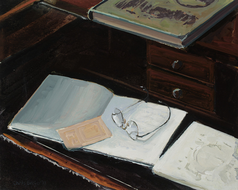 |
| Desk Acrylic on archival paper 8” x 10” Chris Breier © 2015 |
This is the same desk that was featured in the “Library” painting that I posted a few days ago. There are a number of interesting challenges to paint, the transparancy of the lenses was probably the area that I spent the most time refining. The glasses in that era had longer arms that wrapped around the ear and these were a little misshapen, the one arm seemed to be leaning inwards.
Saturday, March 21, 2015
Library
 |
| Library Acrylic on paper 8” x 10” Chris Breier © 2013 |
I enjoyed painting the warm colors of the woodwork; the color of the wood changes dramatically depending on the lighting. The glossy varnish reflects the light from the window so some areas of the wood are almost the same color as the window. The other colors of the desk range from deep orange and dark browns. There were stacks of white chairs for a wedding party outside of the window but I completely edited them out, it’s important to remove the distracting elements.
The globe was a fun object to paint, I wanted to handle it in a painterly manner. The base is a dark oval with a touch of white for the highlight. It’s interesting how a small touch of white can create the illusion of glossiness.
This painting received an honorable mention in the Artist's Magazine annual competition, and was featured in the December 2015 issue.
Subscribe to:
Posts (Atom)